Top 10 Parallax Scrolling Website you Need to See Today!
Are you planning for a Parallax scrolling based website? Parallax website has been in fashion for quite a long time. They are attractive and made in such a manner that it leaves the user with a pleasing experience. The parallax website makes the background of the landing page moving and interesting. It creates a 3D effect slowly when you scroll down the page. Through this post, we will tell you the best Top 10 Parallax scrolling website you need to see today!
Scroll for Your Health

Scroll for your health is a website for health-related issues. It is a website which beautifully lists the fruits narrating the health benefits of it. It has an added pinch of animation attached to it which makes it even more beautiful. This website is composed by Shibui and it can be shared on on Social media as well. Click on the link below, to experience it yourself.
Whiteboard

The White board is another example for parallax scrolling website. This website is simple and full of information. It is a design and development firm which describes it features, work and responsibility opting parallax as a choice to display their home page. It is a simple website enriched with the qualities of parallax which can be counted as one of the inspiration for your own website.
The Royal British Legion
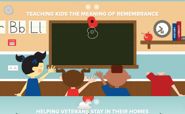
This is colorful parallax scrolling theme based website which takes a tour for the visitors if scrolled. This website has got animated pictures embedded with Youtube videos which are informative and talks about the Royal British Legion. Click on the link below and browse through the website to know it yourself.
Flat V/S Realism
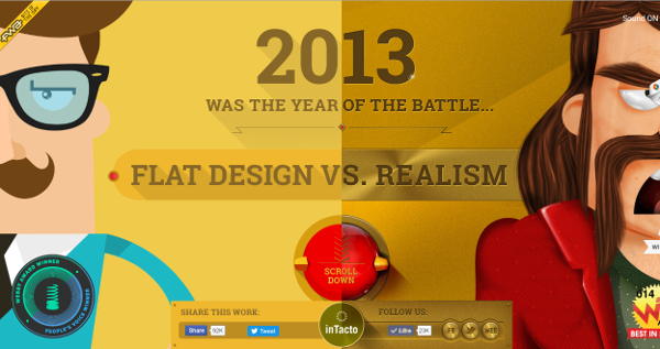
Flat design preceded the digital design. This website has shown the story with the good parallax scrolling effects which includes, sounds, minimal text, pictures and even a game to play. This website is narrative and a positive influence to take inspiration for Parallax design.
Highway One
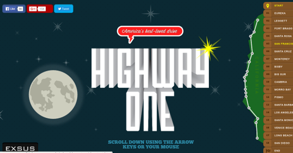
This website will take you on a virtual tour in California highway. It has got good effects mixed with parallax design. It is designed keeping all the elements of the highway. While you scroll down you can see people, clouds, cars and if you click on the link it also shows the Google maps. It is an innovative website which you must put a glance on.
Money Matter
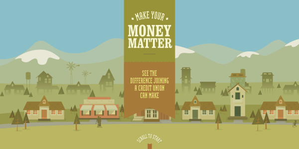
Money matter is trying to inform the public about the credit union and it gets successful by telling the tale in the simplest manner. The website takes you on a tour which begins with a question which nails confidence of the audience. It has a visual appeal which delivers the information using the parallax design scroll in the best manner possible.
Why your Brain Craves Infographics
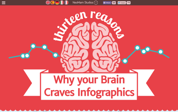
This is a beautiful presentation of infographics by Neo Mam Studios. This article reveals the best reason one by one and it has a set of infographics attached to it one by one. This article explains why we are visually wired. A good example to vouch for parallax design.
Atlanti’s World Fair
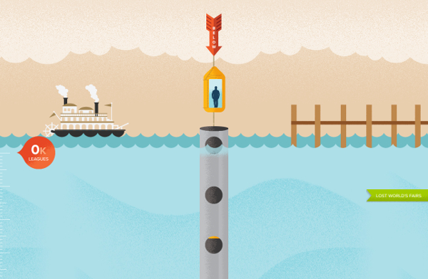
Atlanti’s World Fair is designed by Frank Chimero. It shows IE9’s WOFF support in a way that it tells a story. If you scroll down you will see the plethora of information with the good parallax design. Watch out!
Jackson Ville Art Walk
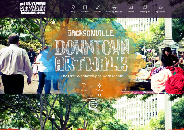
This is parallax design scrolling based website, which organises art walk every Wednesday of the first week of the month. They have updated the website with the information in a compiled manner. It can be considered as an inspiration for the website.
These were Top 10 Parallax scrolling website you need to see today! They are wisely designed and implemented. The content of these websites are less and it consists more of infographics, 3D , pictures and embedded videos. These examples will help you if you are planning to make a parallax scrolling website. All the best!


