10 Best Infographic Designs of 2023
It comes to no surprise that information graphics are still trending in 2017. In fact, they’ve come to be even more popular as creatives, companies, and consumers alike are more attuned with learning through visuals. Infographics are everyone’s go-to source for clear and concise information dissemination in the most engaging and visually appealing manner.

As we reach the first half of 2017, here are some of the best infographic designs to date. These inforgraphic designs cover all sorts of topics and come from various sources. They show you how diverse and well-rounded infographics are, and how you as a designer will surely be inspired to make one of your own.
1. A Guide to the Beatles: Analysis of Songs from the 60’s
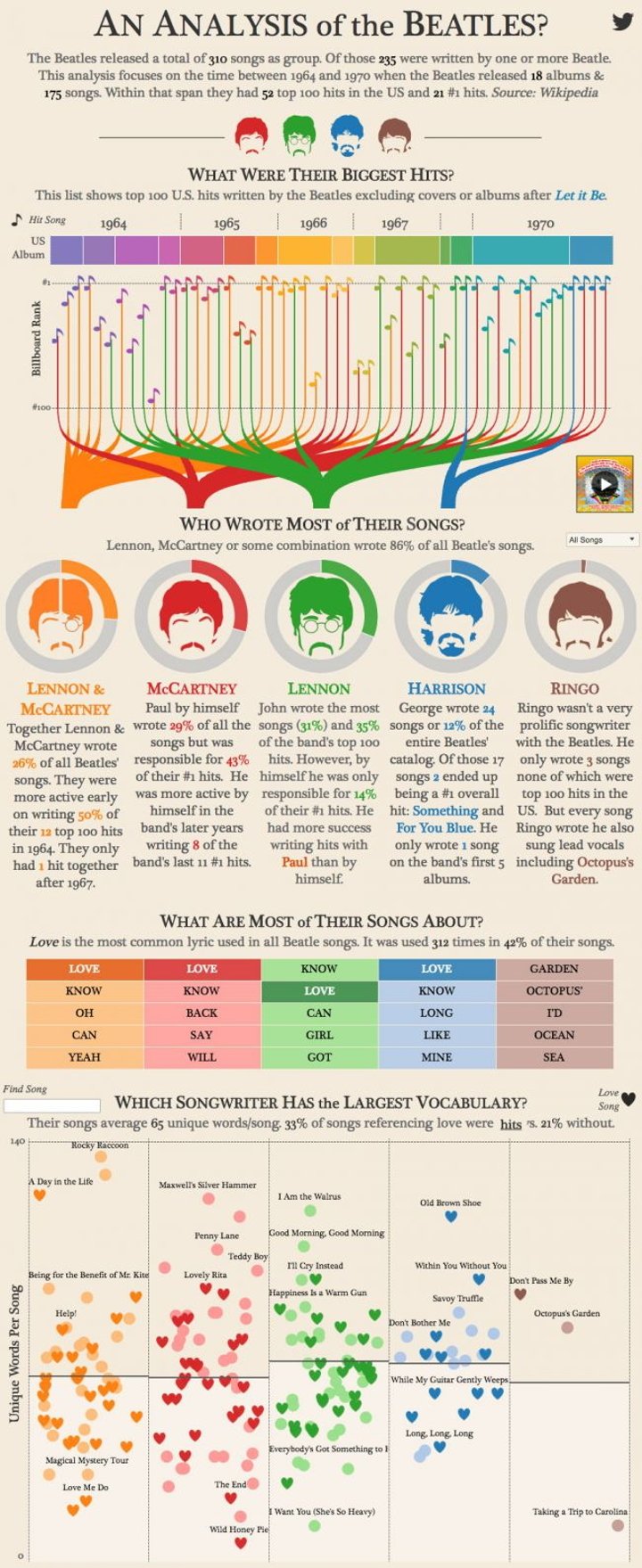
If you’re not over The Beatles just yet (just like the rest of us, old souls), this infographic on their songwriting from 1964-1970 is sure to get you into the Beatlemania hype once more. This charming infographic design analyses the band’s career, albums and songwriting; by showing who wrote what, what their songs were usually about, and who had the largest vocabulary among the four. It’s strikes the perfect balance between text and design.
2. Leave Your Worries Behind with this Infographic
Anxiety is a natural human condition, but if you’re a chronic worrier, that may present some problems in your overall well-being. With this infographic on How to Leave Your Worries Behind, it’ll help you to do exactly that; with researched and science-based games and activities for you to try out.
This infographic design is not only aesthetically pleasing, but it also effectively guides the reader on making better choices and good practices for a healthier mental state. The list of sources also proves the infographic’s reliability.
3. A Well-Balanced Blog: Making Relevant Content
One look, and you’d think this was about keeping a healthy diet. Well it is, but in terms of blogging and providing relevant social media content. This infographic design is definitely one of the best designs we’ve come across because of its metaphorical approach in presenting significant information.
A Well-Balanced Blog gives the blogger and content writer a thorough guide in making relevant posts online by representing types of content according to food groups. Infographics have never been this savory.
4. True Colors: What Your Brand Colors Say About Your Business
Colors generate different emotional and mental responses from consumers, which makes choosing an official color for your brand a crucial step in business. This infographic design shows an analysis on the world’s top 100 brands, and how their logo designs and company colors have contributed to their success. It’s fresh and professional, while being very reader-friendly to all kinds of people.
5. Women of the World: Top Female Entreprenuers
This infographic lets you in on some of the top Gen Y female entrepreneurs who have made names for themselves in the industry. With friendly colors, clean illustrations, and integrated charts and graphs, this infographic effectively presents information that can easily be received by its viewers and readers. Moreover, it brilliantly summarizes its main points through bullets and icons.
6. The Ultimate Hangover Cure
A definite saving grace for most people, this infographic on how to cure a hangover is a timeless and quirky piece of design. It shows you all the ways to get rid of the hangover quickly and effectively, or how to avoid the gruesome experience all together. It’s compact with clear graphics and relevant information you would’t readily receive from any other source other than this one.
7. How Fats Don’t Make You Fat (Carbs Do)
Our brains tend to tune out complex information on the digestive system when talking about carbs and fatty foods. But this Carbs are Killing You! Infographic deisgn can take us on an interesting and informative journey on what we really need to know about carbs and its role in making us fat. Its clean and intriguing graphics effectively simplifies usually complex data to help readers understand and take in important information better.
8. The Late Bloomers of Success
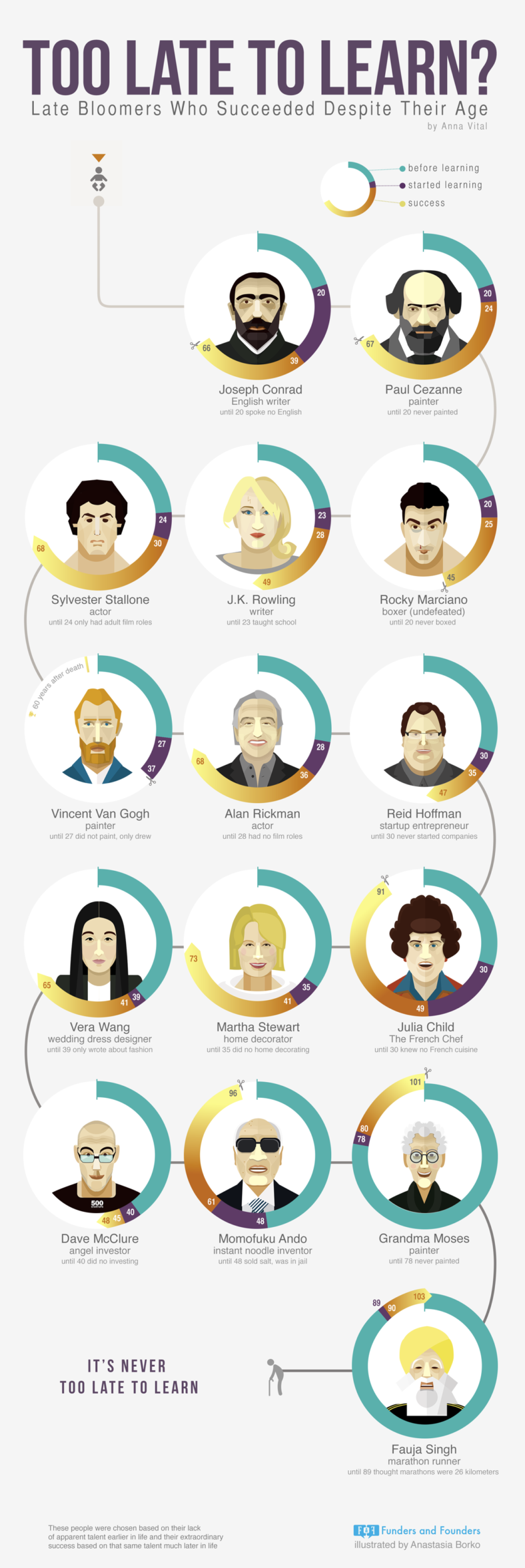
Infographics are also valid sources of inspiration, not just information. This Too Late to Learn? infographic design is a simple yet delightful read, showing you some of the most successful people who didn’t find their niche or passions until the later parts of their lives. It’s a good way to keep late bloomers motivated and inspired to keep going.
This interactive design is a sure win. With stunning graphics and GIFs, this Millennials: Coming of Age infographic tells you everything there is to know about the up-and-coming success-makers and their powerful potential in the business industry as entrepreneurs and consumers. When talking about the generation of today, it is only appropriate to do so using the latest technology for graphics and digital content.
10. An Infographic About Infographics
Last, but definitely not the least, this infographic about infographics will leave your brain full and satisfied for years to come. There’s nothing more humorous and witty than showing you all the reasons people crave infographics so much through an actual infographic. With interactive elements and visual cues, this design by NeoMan Studios is anything but boring.
Infographics are nothing short of extraordinary. They are completely timeless in their functionality, and have so far evolved in design to stay relevant to the readers and consumers of today. Some of our best picks show how up-to-date and contemporary infographics are now because of their amazing fusion of GIFs and animation, to better express the gist of the topic. Keep inspiring yourself with these designs to know how to make relevant infographic designs of your own!


